Yeah, that was a fine example of using relatively simple techniques to maximum effect. This was a case where fine detail wouldn’t have worked out so well. But the broad strokes of color really give the whole scene more “punch”. That and the scattered spray around the center gave an almost dimensional feel to it. Sometimes less detail is more, and these were all things you could do with even the most basic of graphic editors. Ok, outside of the layering and transparencies, that might require something slightly more robust.


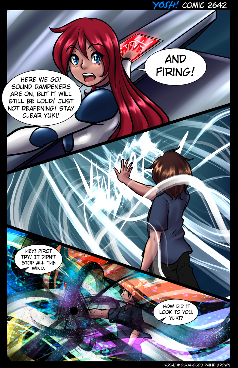
“The colours, man… THE COLOURS! It’s like Woodstock all over!!!”
“You were at Woodstock? That explains a few things.”
“If you remember Woodstock, you obviously did not do enough.”
If you remember Woodstock, you weren´t there.
Did he manage to make an event-horizon? Heck.
Dunno if it’s an actual event-horizon, or simply a small sphere of Absence Of Magic.
reminds me of the black mesa event
Prepare for Unforeseen Consequences
Sage, to say you went above and beyond on that last panel is putting it lightly
Yeah, that was a fine example of using relatively simple techniques to maximum effect. This was a case where fine detail wouldn’t have worked out so well. But the broad strokes of color really give the whole scene more “punch”. That and the scattered spray around the center gave an almost dimensional feel to it. Sometimes less detail is more, and these were all things you could do with even the most basic of graphic editors. Ok, outside of the layering and transparencies, that might require something slightly more robust.
Ok, nerd moment off. Yes, very well done!
k-kakkoiiii
dafuq happened?